Tuesday 13 November 2012

Photo Shoots Write - Up

Photo Shoot One:

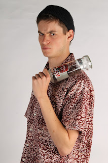
For my photo shoot, I wanted to portray the sentence and meaning, 'A Bailed Up Bimbo - A messed up tough guy'. I chose to do this text first and interoperate into image because during college, my tutor wanted to divide our class into groups and luckily enough a young man was willing to be my model for this shoot. He is very tall and honestly not the most muscled guy, however it was good at the time that his tallness, was a challenge because to try and get the shot that I needed to get, I had to get to the same around height as him and this was very challenging. To conquer this challenge, I had to balance onto my toes so that I can be tall but making sure that the walls next to the back-drop wasn't showing within my images that I was taking. I was also facing a challenge of trying to get the angles right so that the angle of the image would not make my model look too overpowering but also not weak. I experimented with the angles, but as you can see within my contact sheet, you can see that I have stayed with the face on angle to give the image more unique but also simple at the same time. This image shows both height and angled challenges by the way that you can see the wall just above the model's head and above the back-drop and you can also see this image is a bit overpowering, due to the way that the bottle is a lot more higher up than the photographer.

Image that shows both my challenges

Firstly I had to think about how I wanted my model to pose and how I wanted my images' meaning to come across exactly how I wanted them to become. After thinking for a while, I started to shot face on portrait shots, with my model to the side and body face on as well. However this posing wasn't going exactly how I planned, so I thought that by using a prop this might make the image more effective and more natural for my description of the sentence that I am trying to portray. I asked my model to act mysterious and as if he had something to hide from the photographer or someone who is walking towards him, but I also told him to look harsh in his face as if he is trying to toughen up and stick up for himself but overall he isn't succeeding to stick up for himself. So as you can also see on my contact sheet, that my model was moving around in different angels, standing to the side, standing face on and even standing to the side and not looking at the camera. Here are a couple of examples of different poses throughout this shoot:

Angled Pose
Face-on Pose


Side-on Pose

Although I was concentrating on taking my images, my pupils, model and myself were all having a laugh and having fun all the way through this photo shoot, but whilst we were having a laugh, I suddenly came up with the idea of having his red shirt tucked underneath his grey t-shirt to try and make him look more 'muscularly' and 'tough'. I thought that I would do this, because it is soo obvious that due to the size of his arms compared to the 'muscled' shoulders this look does not look realistic or natural, however it does look some how hilarious once you know what is happening within the image and I hope that my viewers will be able to see this. I have chosen to have a bit of his shirt hanging out of his t-shirt so that you are pretty confused on what that object is hanging down his arm, but this brings the mysterious side of my models' personality across. I started shooting and one by one the images that I was capturing were getting better and better, I kept shooting until I got the shot that I could possibly get from this photo shoot and I knew that when I finally got that shot, I knew instantly that this whole idea of 1920's language slang was going to work how I wanted it to.

For this photo shoot, the sort of equipment that I used to create the best lighting that I possibly could to try and get the background as white as possible. I used:

  • One 1100 D Canon camera.
  • Two medium soft boxes.
  • White back-drop
  • Light Metre
 For my image that I have chosen for my final piece, it's camera settings that I managed to fin by using a light metre were:
  • Shutter Speed - 1/125
  • Aperture - F 16
  • ISO - 100
Here is my final image piece for my first title and meaning:


Overall, for this first photo shoot, I think that this shoot went really well because I faced many challenges along the way and I think that I conquered them without any hesitation, so due to this I didn't let these challenges phase me so I just kept going so that I was focused on getting the best shot that I could get.

 The things that went really well through this photo shoot was that my model was very responsive when I needed him to move or to make him loosen up his look if he looked too stiff within the frame and this would make the image look uncomfortable, and I did not want this for my final piece. The lighting up the white background has come up really well, better than I had expected even though it looks grey in some parts, I feel that this helps to give the mysterious look through my image. By having a blank space on the left hand side, and my model on the right side of the frame, this creates a great layout for when I would be applying all of my text onto this image and if I wanted to enhance the image in any way. Lastly I like the way that my model in my final piece has positioned his arm, this makes the feeling of 'toughness' or if he is 'hiding' away from the audience and he is creating his own comfort. I like the was that just from my model's face, he just looks empty as if the emotions of himself had just been soaked up and thrown into a padlock and he doesn't want anybody to find the key because then he will become vulnerable.

If there was anything that I would change about this first photo shoot, would be that I would not have any shadows on the left side of his face. The reason for this is and there are shadowing is because the right medium soft box, was too closer to the model than the soft box to the left hand side of myself. This caused a lot of shadowing, but I thought deeper and I figured out that when I was measuring both of the lights with a light metre, I think that I made the right soft box a lot more brighter than the one on the left.

Overall my photo shoot went really well and I am soo pleased with my outcome for 'A Bailed Up Bimbo'. One reason for this is because I was having fun whilst shooting this shoot which I was intending to do and I will be intending to do throughout the rest of my shoots, two because y model did a fantastic job being well concentrated whilst being very confused on why I got him to put his shirt under his T-shirt and three because I managed to achieve a great outcome that I really like.


Photo shoot two:

For my second photo shoot, I wanted to portray the sentence and meaning 'A Flapper And A Giggle Water -  A stylish, brash, hednostic young woman with short skirts and shorter hair'.  For this shoot, I had to book out the studio and to start to become independant within myself so that I would get used to the feeling of using the studio by myself. My model that I was using for this shoot

Wednesday 31 October 2012

Contact Sheets And Lighting Diagrams For Each Shoot

To show all my images from all my four photo shoots, I have created a contact sheet for each shoot to show that I have experimented with different angles, poses and shapes because this shows that I have tried everything to get the best final image that I possibly could create. Also with my contact sheets for each of my photo shoots, I have created a light diagram of what lighting equipment that I used, and how my model was positioned.

But first off, to book out a studio for me to use for all four of my shoots, I had to fill out a studio booking form which consists of a risk assessment, an equipment list and whether I needed a model release form. Here is a scanned copy of what a booking form looks like:


On this booking form, there are three steps that can be seen very clearly, but the thing is it's harder than it looks to fill it out, due to really thinking about every stage of the booking form. Step 1 which is the risk assessment part, is about what sorts of hazards could there possibly be within the studio when you are using it. You have to rate out of 5 being the highest, and 1 being the lowest on the possible of the risk happening and for the severity of it happening. After this you have to multiply the two numbers together, and if the end number comes out higher than 5 or just 5, you have to make solutions up and then rate the risk and the severity.
Step 2 which is the equipment list, this basically asks you for any equipment that you will need  so that the technician would be able to get every bit equipment ready for you to use and put together for your set.
Step 3 is a model release section where it asks you whether you need a model release form or not. A model release form that asks the model for all their information details. The model would have to sign a yes or no box whether the photographer would be able to publish the photograph or not.

Photo shoot one's contact sheet:


Photo shoot one's lighting diagram:


 Photo shoot two's contact sheet:


Photo shoot two's lighting diagram:


Photo shoot three's contact sheet:


Photo shoot three's lighting diagram:


Photo shoot four's contact sheet:


Photo shoot four's lighting diagram:


In-Depth Critique Of A Photographers Work

My tutor set us a task to be able to critique a famous or non-famous photographers photograph. She  gave us a sheet which gave us an in-depth guide on how to construct an in-depth critique. From doing this, me as an individual I would gain knowledge and get used to the fact that we are going to have to get used to critiquing other photographers photographs.


Ralf Weinbrecher

8th December 2008

This photograph doesn't have a specific title, but it is part of a project that this photographer was undertaking called ' Famous Photographers Quotations'.

I think that the purpose of this photograph is to document personal pictures that he has taken himself, not just self-portraits of himself but object images as well. He added famous quotes from famous photographers to give the picture some meaning. Through looking at this picture, I personally feel that the subject of this photograph is a personal reason for the photographer who has taken and created this photograph. By the text that he has created to place on this image, it brings a feel of a personal statement as if the photographer of this image has written it himself.

The first thing that stands out and draws my eyes towards this photograph is the Praktica film camera and the depth of field between the camera and the photographer. I think this is because the Black and White effect makes the depth of field more deeper and mysterious, due to the only objects that are in place which are the photographers two hands and the camera. I feel that the artwork for this image is trying to put a message across to the viewer that he is trying to portray the words of the quote as his own. I feel that he is trying to bring his emotions through the quote by as he was saying it himself, but he doesn't have the nerve to say it out loud as a quote for himself. So for this he has had to get someone else's words to portray his emotions for him. I also feel that the artist is trying to say within this image is that the self-portrait that he is taking of himself, have a more greater meaning than the images that he has and is taking pictures of other people. Also that the self-portrait is representing more about himself than he thinks himself than through photographs of other people.

The techniques that have been used to help the message from the text and the image together, are the depth of field and the lighting within the whole frame. I feel that the depth of field has been used to help the message because the way that the face of the photographer is very close to the camera, but also this shows the personal, however if the photographer had his head further back from the camera, the photographer will feel distant towards the viewer. I feel that the lighting also helps hugely to get the personal meaning of the photographers emotions. I also feel that the lighting helps due to all you can see is the photographers hands and face all lit up, due to the photographer photographing this image in a mirror. The background is very dark so I find that this makes the image more meaningful because of the personal aspect behind the text. The formal elements helped me to understand the photograph, due to the pose and shape that the photographer is making because it creates the emotion of the image more greater, due to the way that it is just a natural pose and it is not uncomfortable to view. I find that the typography of this image is effective in the way that the font isn't fancy, it is easy to read and it gives great effect that the colour of it is white because it stands out and you can't miss it.

Overall I think that this photograph is very successful on my topic of text and image, by the way that the text really compliments and helps the viewer to understand why they have taken the image and to understand the emotion behind it as well. I also found that by having the quote from Richard Avedon, really creates the sense of mystery because you instantly feel like the photographer Ralf Weinbrecher is saying himself. I also feel that this photograph is successful because it just makes the viewer question about the image more, these are the sort of questions people might of thought of:

  • How is he feeling?
  • Why doesn't he have his own quote?
  • Why is it in black and white?
  • What is this image really about?

Questions like this I asked myself because this is what a successful image does, it makes people question the image and think more in-depth about it.

Monday 29 October 2012

Ideas Generation

For my ideas generation, I have mind-mapped through all the sort of ideas that I could make my typography and what sort of meaning I want my images to portray. Throughout my project I am mostly focusing on the language in my text and that my images will be supporting my text, whereas many people would do it the other way. Due to me thinking like this, I had to make my project individual and different from all my other pupils, so I thought more about my typography than how my pictures would come out.

My mind-map of my most important categories that I had to focus on when creating my idea of what I wanted to do for this project:


These four areas that I have focused on, I have written lists of questions that I could see for what sort of feelings would be more effective to the viewer, so from this I can see which would suit my project the best. Here are my ideas for all four categories:

Typography:
  • Involves humour.
  • Can come across very serious.
  • Can become emotional when being read.
  • Can be sensitive/insensitive.
  • Can be comfortable or uncomfortable to read.
  • Would the text look obvious with the image or would the text seem a mystery when read?
Portraits:
  • Would the message of the typography come across more powerful if the image was a mug shot or just a natural image?
  • Would the message be portrayed more if it showed just the models's head and shoulders or if the whole body showed more of the message than just part of the boy?
  • Will just the face emotions come across more powerful for the text to get it's message across or will the full body or mug shot do this a lot better?

Still Life:
  • Would I use a big object?
  • Would I use a small object?
  • Would there be many objects in the frame?
  • Would I want to be comparing objects to one another?
  • Would I have just one single object?
  • Would I have a very meaningful object or a not very meaning object at all?

An Object With A Model:
  • Should there be a a comparison between the model and the object?
  • Should we be feeling a history between the model and the object?
  • Could we possibly feel and see the five senses when viewing the images?
  • Could the image feel mysterious and a bit uncomfortable between the model and the object?

From doing these questions, I did finally realise that I wanted to focus more on the typography that I will be placing onto my images than the images itself as I ave already quoted, but suddenly when I thought about typography I thought for how I can use different ways of language to show a different approach. Thinking through a long period of time, I came started to think how different cultures use different sorts of slang, however when I researched slang words most of them were quite predictable and you could know what it meant as soon as you heard the word. From this I wanted to use words that sounded quite humorous but also quite mind boggling, so that my audience would look at my work differently and not be judgemental by saying that the words are 'typical' and 'obvious'.

Thinking into different sorts of slang, I randomly started to look back in history to see how words have changed. I came across funnily enough some slang words from the 1920's that were very effective and damn right different to anything I had ever seen before with any type of slang I had ever seen.

Here is the website for where I got my slang for my final four images:

http://local.aaca.org/bntc/slang/slang.htm

These are the slang words and their meanings that I have chosen by randomising different words together:
  • A Flapper And A Giggle Water - A stylish, brash, hedonistic young woman with short skirts and       short hair, with an intoxicating beverage; alcohol.
  • A Bailed Up Bimbo - A messed up tough guy.
  • A Dumb Dora And A Handcuff - A stupid girl and an engagement ring.
  • Stuck On A Rag-A-Muffin - Having a crush on a dirty, disheveled individual.
The reason why I thought of using these slang words was because the more I randomly mixed up many, many different words, and the funnier the word, the funnier the outcome was. During mixing and matching my words up, I came across these four different sentences that I wanted to use and the reason why I have taken these four to be used in my final images to match my typography was because I wanted to show what the text meant in imagery and not just in the typography. The way that I am going to do this is by making the image look so obvious it's unreal, but when capturing these pictures, I wanted to have as much fun as I possibly can when I started to shoot my photo shoots.

Typography:

The first way that I wanted my typography to come across was to be quite unique, in the way that my typography would be different to any fonts that you could ever find on any Microsoft Software programs. I visited the website http://www.dafont.com/, to see if I could find any fonts that I might of decided to use for my final four images. Here are a few examples that I have been able to find that I might have fancied to use:

Font - Fashion Victim

 Font - Laff Riot NF

Font - Little Lord Fontleroy

Font - Upper East Side


These fonts that I have as examples, I now feel that looking at them I wouldn't be able to use any sort of font like these for my final images, because I find that when viewing these fonts, the font for the slang sentences, are going to have to be used for the meaning of the sentences. I feel that this will bring too much attention to the text, but I want to feel like my text compliments my images, but not in the way that it stands out in your face too much. I  also find that these types of fonts, would look a hundred times better if there was just one word describing the image rather than a sentence and the meaning. However I feel that by doing this investigation on experimenting with different fonts, I have now been able to think more in depth about my font, than I thought that I would of have to, but i find that I have learnt something new by doing this and I will be able to take this knowledge through to any other projects that will involve typography.

Furthermore I have been thinking of using a completly different layout than I thought that I would of used but I have gone with the layout of a Dictionary.
Here is an example of what I mean:


The reason why I have chosen to experiment with a dictionary layout for my text, is because I feel that because even though I am describing a sentence through a meaning as well, it feels that just having a sentence and then a meaning in an ordinary, simple layout, would not be as successful as I would wish it to be. So due to this, I thought of a way my text would be at it's most effective when the whole piece of imagery and text put together. The way that I managed to come to this final outcome, was by experimenting different ways that I thought that a layout for a sentence and a meaning could come together as.

Here are some examples that I experimented through:

No.1    A Flapper And A Giggle Water = A stylish, brash, hedonistic young woman with short skirts and short hair, with an intoxicating beverage; alcohol.

No.2    A Bailed Up Bimbo: A messed up tough guy

No.3   A Dumb Dora And A Handcuff - A stupid girl and an engagement ring.

No.4    Stuck On A Rag-A-Muffin:

  • Having a crush on a dirty, disheveled individual.

No.5 ( Final ) :  

I thought that this dictionary layout was the most strongest way to show my text because due to the unique and different layout, this makes the viewers more aware of what the text says. The reason why I have added the ;n. ,  ;n. ;Pr and the (British) language slang within my text, was because I wanted to make the whole layout look quite different compared to a normal dictionary layout. The ;n; and the ;n; Pr;  really just makes the look of a dictionary, however it does have the meanings of a 'Noun' and a 'Pronoun', but really in my text, it means totally nothing. The (British) language slang, just shows what the sentence means, in the sense of genre, but it does not tell you the meaning of what the sentence means until the next point. I think that it was quite a good idea if having this as a part of my text because I think that it gives the viewer a guide into what I wanted to particularly stick to the language from the 1920's and this is how I was going to show it off in my final pieces.

I had to think about what sort that I wanted to have for my final pieces. To decide on what sort of font I wanted to use, I typed into the internet on what sort of font is used in dictionaries on the web. The sort of fonts that I found out were, classic serifs like Baskerville, Garamond, Minion, Century Schoolbook or even the good old one such as Arial. 

Here are the examples of all the listed fonts:

The reason why I have done this was because you can see that because I have shown all of the fonts altogether, I could easily choose which font I mostly liked to have on my final images due to the easy way of comparing all the fonts together.

I chose the font Baskerville due to the fact that because it was quite an easy comparison between all the fonts together, the Baskerville font looked most professional. The reason why I think it looks most professional compared to the other fonts is because the font has a natural boldness to it, unlike any of the other fonts. However, the font Arial does have a boldness but the individual letters, are too big. Whereas Baskerville's letters are quite small but they are capable to read and they are a nice size.

So as you can see here, I have done all my sentences and their definitions, and I feel very happy with all of my outcomes that I have achieved to get:


Tuesday 23 October 2012

Research Into Photographers Working In Studios And Using Text

For this project I have had to go away and research photographers who specialise in studio portrait photography and photographers who specialise text on their images that back up the meaning of photographs. I am doing a separate studio portrait photographer because I am planning myself to do portraits for my idea for this project.


Hemant J Khendilwal : Studio Portrait Photographer

Hemant is a an amazing studio portrait photographer who has exhibited his photographs in many exhibitions such as the Soho Gallery in New York, The India Habitat Centre, the British Council and the French Cultural Centre in Delhi. So manly because I chose to look at his work is because he has exhibited in many well known photographic countries around the world where many people really appreciate photography in the way that art and design really falls into it. But I have also chosen to use Hemant's pictures to use as examples for good studio photography because even though he is not well known, he gives me inspiration to create portraits of my own for this project and not still life, (I'm focusing more on the portrait than the text in these pictures). Hemant has done and accomplished to shot do the Deutsch Vogue Magazine which is a great opportunity for you to show your skills to many readers and other photographers and due to seeing he has done this, I have planned to use a couple of his images to use for my relevant research for my idea that I have in mind for my project.

Firstly I have chosen to use this image as one of my relevant  research because I very much like the innocence behind her look, but I feel that there is a dark horse within her. I like this picture because I am focusing mostly on the lighting that has been used in this image than the text and the background. I am looking at this picture, particularly in the lighting because due to the lighting, it creates a mystery vibe behind her look because the photographer has used Hard Key Lighting. The photographer has used Hard Key lighting quite well due to him not using the lighting to the extent where you can notice all the model's imperfections, but where you can see darkened shadows near her hairline, very close to the highlights on her forehead and nose area. This image shows off one of the biggest mistakes I can ever think of, and this is by noticing and figuring out how the photographer positioned his lights. But I am very happy with myself because all my knowledge behind studio photography, I have been able to see the the way that you can see where the light source was coming from. So from this picture, the light source is coming form the right hand side. I know this by the way that you can see the shadowing on her cheek and  as you scan left over the rest of her hair and also her clothing the shadowing is gradually getting darker and darker. I thought to myself about how many lights the photographer might of included, I thought about two lights, one around head height level and one above the model. I estimate this because I can see that the top of the model's head, is lit up really well and if there was just one light at head level you would be able to see shadowing.


I have chosen this photo as one of relevant research because I wanted to create my images like this in the way that the lighting is different and because I find that if the picture has a crisp white background, due to Hard Key Lighting. Due to the Hard Key Lighting, the viewer is able to take in what is happening within this image and even though this sort of lighting shows imperfections on anything that you are capturing images of, you are still able to see everything that you are wishing to see when viewing similar images to this exampled photograph.
I have also this image because I find that all the contrasting colours are standing out very well against the white background. I want to use this same technique within my own images that I am going to create because they will stand as very powerful images when they are being viewed. Mostly I am using this image as a relevant research because the background that the photographer has used makes him as a photographer look very professional and unique  when his work has been published. The last reason why I like this image is because there are no distracting shadows that are drawn to the viewers eye straight away, and the way that the photographer has used the lighting for this image, shows that he has been very precise and practical with the lighting equipment that he has used to create this sort of image. My opinion of this image when it comes to the lighting equipment, I have made an estimate on how many lights he has used to create this image and I imagine that by using around three to four big, hard lighting attachments onto lights are coming from the left hand side, from above and below the model.
The reason why I don't personally want to use shadows in my own images that I am going to create for this project is because I find that my images would get undervalued if there was a great amount of dominant shadows protruding into images. I would also find that the meaning that I am wanting to portray across to the viewer would not be as powerful as intended.


James Lomax : Text on Image Example

James Lomax is a English Photographer who is based in England whose day job is a librarian in his local library, funnily enough, he is an amazing photographer who has focused on many different projects, such as Photography-writing. He quotes to this on his website that he specialises on this topic hugely because it is a  neglected art. His history was that he went to university to study many things but in his second MA Degree in Photography, he undertook many projects such as environmental portraitures, jazz music and mountain photography. It shows on his website hat he has previously taught English and this is one reason why I have chosen to write about him and one of his images with text as one of my relevant researches.

I chose this image because when I first saw this image, it looked pretty bland and obvious a if there wasn't any big meaning and he had just casually captured a sign on a snowy bridge. However  when you read closer into a picture, you get a shock of really why this image has been taken and this is exactly what I thought when I read further into this image. When I read through James's meaning behind his image, he wanted to show the relationship  between image and text, between the photo and the description and how one photograph can denote one thing or something else entirely, based on how it is described. He asks on his website, ' can a photograph stand on it's own, or does it always need a description?' I like this rhetorical question because I find that it is different that a photographer would even ask this about his own photograph, even though he has created this picture himself, and I also find good because even if you tried to answer that question, there would be no real answer only a prediction.

With his image that Lomax has taken, he has put many scenarios or definitions, whatever is better to describe them as, that could explain why there ia a sign and gates or just explanations of what the image is about.

Scenarios/definitions:


  • Man falls off pier, dies in icy water.
  • Record levels of snow close Lake District tourism
  • Windermere wildlife decimated by Arctic weather
  • Photographer finds beautiful, graphic composition

With these different explanations, all of them could be true if you put that certain definition with the picture, it could and would be believable. But because there are many various definitions, this shows me that my text and image images, could be seen in many different ways or could put it to one obvious definition. For this reason I had to think whether I do want to have my images that give a bit of mystery within my pictures. Also from this, it has shown me and I have learnt that text does give an image more identity and a bit more of individuality and it shows that typography is a huge thing within the photography world and it is very popular and there are so many creative ideas out that that could give inspiration to anybody who views them.

Lastly Lomax describes this image as 'The Third Effect' because he said that it's 'subtle', 'complex' and 'powerful', however this method shows that whether it's the text within the image or either pared with an image can change the meaning completely with or without the text.


Saturday 13 October 2012

Text and Image : Analysing Images With Text

We got given a new brief called Text and Image, and for this project we had to achieve four final studio images with edited text to combine with the images. To start to give us ideas about what we wanted our images to portray, my tutor gave us two images that we had to analyse to understand how text is a great contributor to images, and how the composition of the image really effects the emotion or meaning of the image.


Barnardos Campaign:

How has the photographer made a very simple image very powerful?

I think that the photographer has made this image powerful by the way that due to the hard lighting of the image, the boy looks very pale and could look very ill to many people. The way that the hard lighting gives this impression is because the fact that hard lighting shows every imperfection very sharply within a portrait shot like this. Another way that the emotion has been captured from the boy and the reason why you can see this is because the boy is looking right into the camera lens , as if he can see you. This makes the viewer feel sympathetic towards the young boy because children are supposed to look happy when they are having their picture taken because they want to show off to the camera. However with the boy you can feel that something is stopping him from being himself and acting like a child his age.


How does the text effect the way that you read the image?

The way that text makes you read the image differently is by the way that they have made the most shocking part of the text bold, so that the viewer can easily get attracted towards it and read it.  This can make them develop an idea on what the image about and understand why the boy looks and gives that feeling off. The text I think indicates that the boy has been through a lot due to the charity showing his case to the public through a campaign and by through text and not just an image. This shows that other people who don't know him are concerned and they want  to raise the alarm that other children are suffering the same case and this shows that the charity would support any children who have a similar case. I find that from doing this campaign, they are trying to reduce these situations by making people more aware of what's happening behind closed doors.

What does the level position of the camera and the 'Square-on' composition do for the image?

I think that the composition of this image has been well planned, to make sure that the boy's eyes show off the pain and suffering within about how he has been feeling or has physically felt. This can be backed up by the way that the 'square-on' composition has been shown, and this can be seen by the way you are drawn in by the centre object's, which are his pin-point eyes. The way that the photographer  has only photographed his head and a bit of his shoulders, makes the image more powerful by feeling the sense of innocence from his long distant gaze but also helplessness vibes from his face expression.

Is the boy treated with dignity?

 I think that the boy is treated with dignity because even though the boy seems lifeless, the text shows that he is a strong believer in thinking that he is sticking up for himself through any situation, but really the image shows that the boy cannot do this task on his own and that he needs help. This campaign strongly shows that they can help children in the same way. I feel that if any more of the boys body was shown with an object, the purpose of

How does his direct gaze into the lens effect us?

His gaze shows us the pain and suffering that he is trying so hard to hide but realistically it is so obvious by the glare in his eyes to the naked eye. The dark shades under his eyes make us feel that he has put in soo much effort into whatever he is trying to tackle and fight that the strain and exhaustion has caught up with him and this has been made visible to the eye of the viewer.

How about if we could see more detail in the boy's surroundings? For example, if he was holding a sinister object in his hand. Would these additions change our view of the image?

I think that if the depth of field was a lot different, the image would have a different feel and it wouldn't have the same mysterious meaning that can be shown within the image. I feel that if any more of the boy's body was shown with an object, the purpose of the image, would be a lot different that the text  and the photographer have tried to imply through using the hard lighting to show of the result of stress and tiredness of a young child. I think that the image wants people to realise the effect of this sort of stress on children and to show that they are not alone and that help and support will always be offered if wanted. Overall I feel that this image would be ruined if anything was changed or added to the image because the composition is the main focusing point in this image and the subject' eyes.


John Hillard - Cause of death 1974


Discuss how the framing of the photograph
encourages the viewer to 'read' the image?

I think that the framing encourages the viewer to 'read' the photograph is because the framing of the image  is so unusual and unique compared to many pictures you would ever see today. I find that John Hillard  has cleverly framed this image so that there is four split sections, because every section tells a different story. But really all four images create one image. I find this has been amazing planned and shot carefully so that all the image could be put into four separate images in the final stage. I think that people would be drawn into this image because  of it's strange an individual format and meaning in each section.

Discuss how the image would present differently if it didn't have the captions?

I think that the image wouldn't be able to present it's meaning without the captions because the image is slightly strange any-ways, but I  feel as if the text captions tell the story about what happens and even though they are single words, the story has been squashed  into one effective word to describe every scenario. With images like this, they need a helping hand from text to be the storyteller.