Because I wanted to shoot Low Key Lighting, I had to change my camera settings from Hard Lighting, because this will allow too much light entering the lens to make the effect of the lights not as effective as in Low Key Lighting could be. So to make my photo look more effective on it's outcome, I had to keep trying to under-expose my images by two F stops or by as much as I could to get the best outcome I could get. For my first shot in this photo shoot, I used the settings of ISO 100, Shutter Speed 1/125 and Aperture F 14. From this I wasn't really sure if that was the outcome that I wanted to achieve so I became more experimental and started to fiddle around with my settings more to get a better understanding of how a Low Key Lighting image should look like and how I could get the best shot that I could possibly achieve.
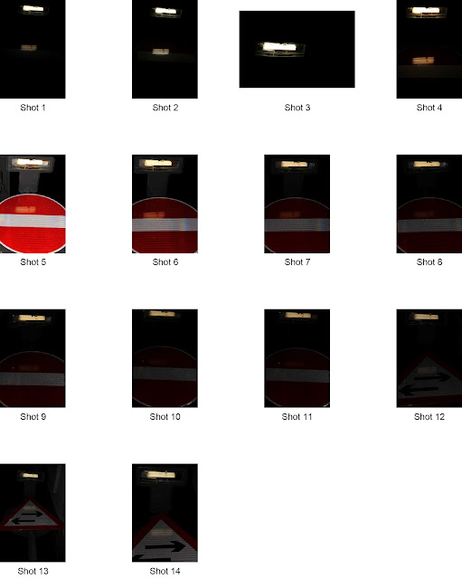
This is my contact sheet for my third photo shoot:
When I went out to start to take this shoot for my third and final shoot for 'Illuminance', I had to be careful whether I wanted to take an image of a lamppost or signs next to a household. This is because the people who are living there might not be 100 per cent certain on what you are doing and they might become suspicious. So before I started to raise concern, I only used flash a couple of times just to experiment but the best thing is not to use it at all before all the attention was on me. When I had thought through what to do and what not to do, then I began shooting my shoot. Firstly I started off by photographing signs and direction signs, which had tungsten lights which shows people what they are. So I went through photographing these signs around where I live, but the outcomes that I was wishing for weren't what I was expecting. However I kept on trying to succeed, but in the end the images weren't as powerful and effective as I wanted them to be.
These images that I have chosen to show from this shoot can show that the composition of myself and of the signs/directions, are not brilliant. So due to this I tried changing the angle and settings of my images but I did not succeed. Overall I really didn't want to use any of those images as one of my final images, because they don't look as professional enough and doesn't fit my theme as much as I would like them to.
Here are a couple of examples of my first shoot:
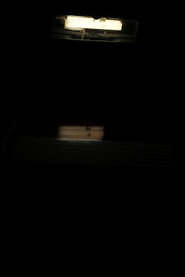 |
| Shot 1 |
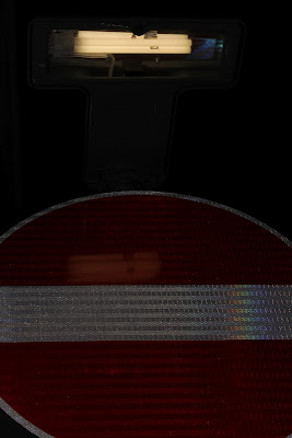 | |
| Shot 7 |
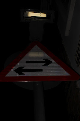 |
| Shot 13 |
I did use flash a couple of times, just to see what the outcome would have been and how I could compare flash images and non-flash images. So between these two images below, you can see that when photographing with flash, the image is not very detailed at all and all you can see if very hard lighting in this image other than Low Key Lighting. With using flash to do Low Key Lighting, it really doesn't work because the flash brings all the imperfections arise very strongly as can be shown in this image. With the image without flash, you can tell that no flash has been used due to the very slight glow on the tungsten light and the glowing orangy colour, that gives of a warm, soft feeling. The image I used flash for, I did this because I wanted to just see what the outcome would turn out as and now I would now know how to compare images that have used flash and ones without flash.
I can now compare flash and non-flash between my images, by the way that you can see the images that I have used the flash, the image is very detailed but the lighting is Hard Lighting not Low Key Lighting that i want for my overall image. You can also see that the flash brings out the object's imperfections and this can make the image look ugly and not thought about when captured. However with the image without flash, you can see only the slight reflection of light which is reflecting from the light source onto the sign. This shows very good low lighting because without seeing the image with the flash, you would not know what the object is that the light is reflecting onto. You can also see that you can not see any imperfections in this image and only small detail which is hardly visible.
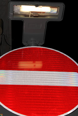 |
| With Flash ( Shot 5 ) |
 |
| Without Flash ( Shot 1 ) |
Once I had reviewed my previous images of the signs I knew that they were not as professional as I wanted them to be so I set off on another shoot still focusing on street lights, preferably lampposts. So when I went out focusing on lampposts, I wanted to get some great effects and outcomes from this shoot. I was also focusing on what effects that I did want, like big eccentric lighting effects or even just small impressive effects that people don't really notice of. So to do this, I walked around my neighborhood like I did on my first shoot with the lights and signs, and I can across this lamppost that was right next to a house, but the guttering was blocking some of the light passing down onto the pavement and the effects of the light looked like the lamppost had wings of light.
This is my contact sheet of this shoot:
During this shoot, I had to change my settings to make the effect of the lighting become more seen and effective. When shooting my last shoot on signs, I had to have my settings so that my images would look very Low Key to try and make the effect of reflecting light onto the object more seen and appreciated. However in this shoot I tried using the a different aperture to start off with to see if it would make the lighting effects more eye opening.
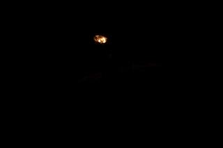
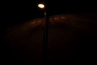
With my first image that I had shot, I used the settings 1/125 Shutter Speed, F 22 Aperture and 100 ISO. However with this image, you cannot see any detail within the light effects at all and I could see that the aperture was too big to make the image that I wanted to achieve. So from here I changed my Aperture dramatically from F 22 to F 5.6 to see if any change would make a difference, and it did! With my third shot, you can notice that the effects of the light are more visible and from this I now had an idea of what sort of Aperture I needed to investigate around to get my final image. During this shoot and my contact sheet, it showed that I was zooming in, changing directions and experimenting with different angles to try and see which is the best way to go to create my best and final image.
 |
| Shot 1 |
 |
| Shot 3 |
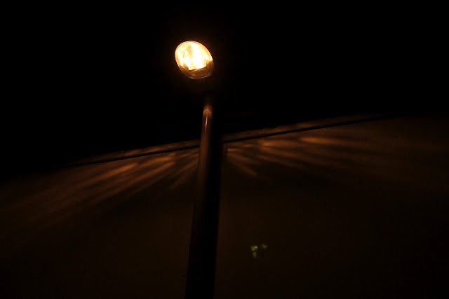
This is my final image for this final shoot and I am very proud of this outcome that I have been managed to produce. The reason why I chose this image for my final outcome is because the composition of the image is very predicted for an lighting image like this. This is because the angle that I positioned myself to produce this image is from a 45 degree angle to make the image look a bit more unique but I also wanted to make my image look very simple but very detailed when you really focus onto the effects on the wall. The reason why I said that my final image would partly look predictable is due to thinking that I would take an image like this, but I like the way that my image is clear on the lighting effects, because if it was hard to focus into the detail of the lighting effects of the lamppost, the image would not be as effective as I would have wanted it to be.
The settings for my final image were Shutter Speed 1/125, Aperture F 5.6 and ISO 100. I stayed with the aperture F 5.6 because I felt that when looking through my previous images before my final, the warmth of the colours and the Low Key lighting were as perfect as I was going to get them, because I thought that if I went any darker the Low key Lighting would be hiding all the detail away from the effects of the reflected light. One part of the image that I would change for the future is that I have a lens flare in my image but I feel that from this it creates a real look into taking images and shows that I haven't tried to edit out any imperfections or anything. I feel that sometimes images need imperfections to show that you could do better in the future and you can learn form your mistakes.
The colours in this image makes the image look very warm and comforting when you first come across it, and this is what I wanted to achieve because I wanted to make my image approachable but in the same way mysterious and gloomy, due to the Low Key lighting.
This is my final image for my Third Photo Shoot:
 |
| Final Image |

No comments:
Post a Comment